We use “5 second tests” to fine tune this first glance experience. We flash the design to testers for 5 seconds, then we ask what do they remember. This tells us what information did get through in this short time and what did not.
1st Case study
Brickflow is a SaaS for Tumblr users. It analyzes your tumblr blog, offers you new content that fits your style and you can post those with a click. It is easy to keep a fancy tumblr blog up and running this way. We tested two variations for the landing page (above the fold part). The text is the same on both, the big difference is the background image. Which image tells you better what Brickflow does?
5 seconds was enough in both cases to tell that Brickflow was something related to Tumblr. But only the second image made it self-evident that Brickflow is about getting content to share on Tumblr. Thanks to 5 second tests Brickflow was able go on with the landing page image that transmitted the value proposition better.
2nd Case study
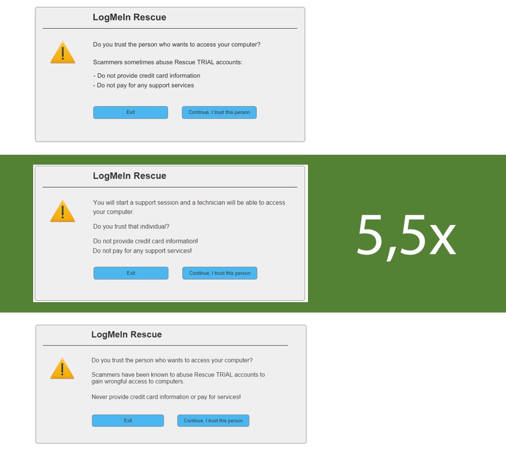
LogMeIn Rescue helps regular people to connect with technicians so that techies can repair broken computers remotely. Safety first – this popup warns people about some dangers. Five second tests told us that the second version of the same warning made 5.5x more people to get the message than the other versions.
3rd Case study
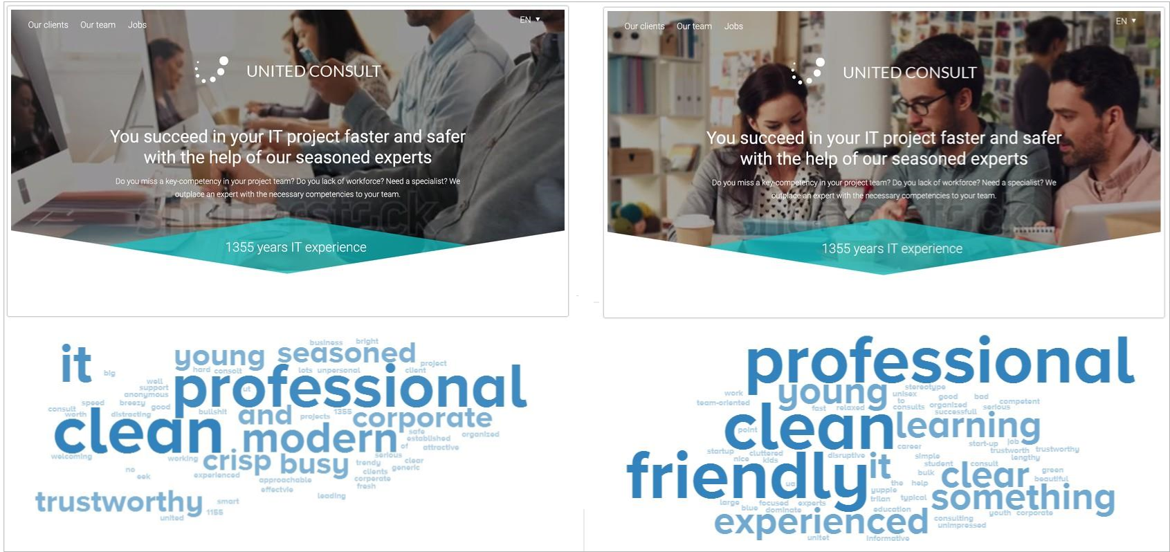
Five second tests are great for emotional fine tuning of websites. The following is the home page of United Consult – its core aim is to attract new talents to the company by conveying the unique atmosphere at UC. The debate was going on about background images. They differed only slightly but five second tests gave us an objective feedback about the differences.
note to design managers: which color communicates the corporate value the best? What associations do certain words elicit in the minds of the users? Quarreling over such questions can be such a waste of time! Here is a research method to help you out.
4th Case study
Other times we use five second tests to investigate if a logo is understandable enough. There are tons of logos out there that are considered “clever” because nobody gets what they try to communicate. 🙁
FedEx logo – have you seen the arrow?
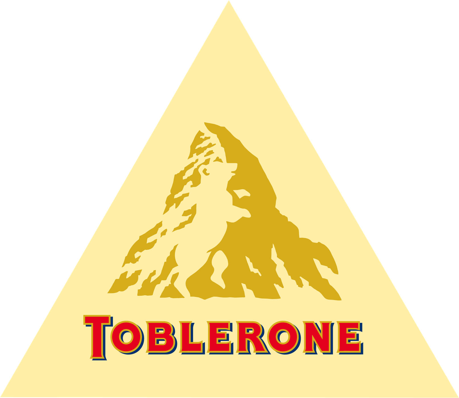
Toblerone logo – have you noticed the bear?
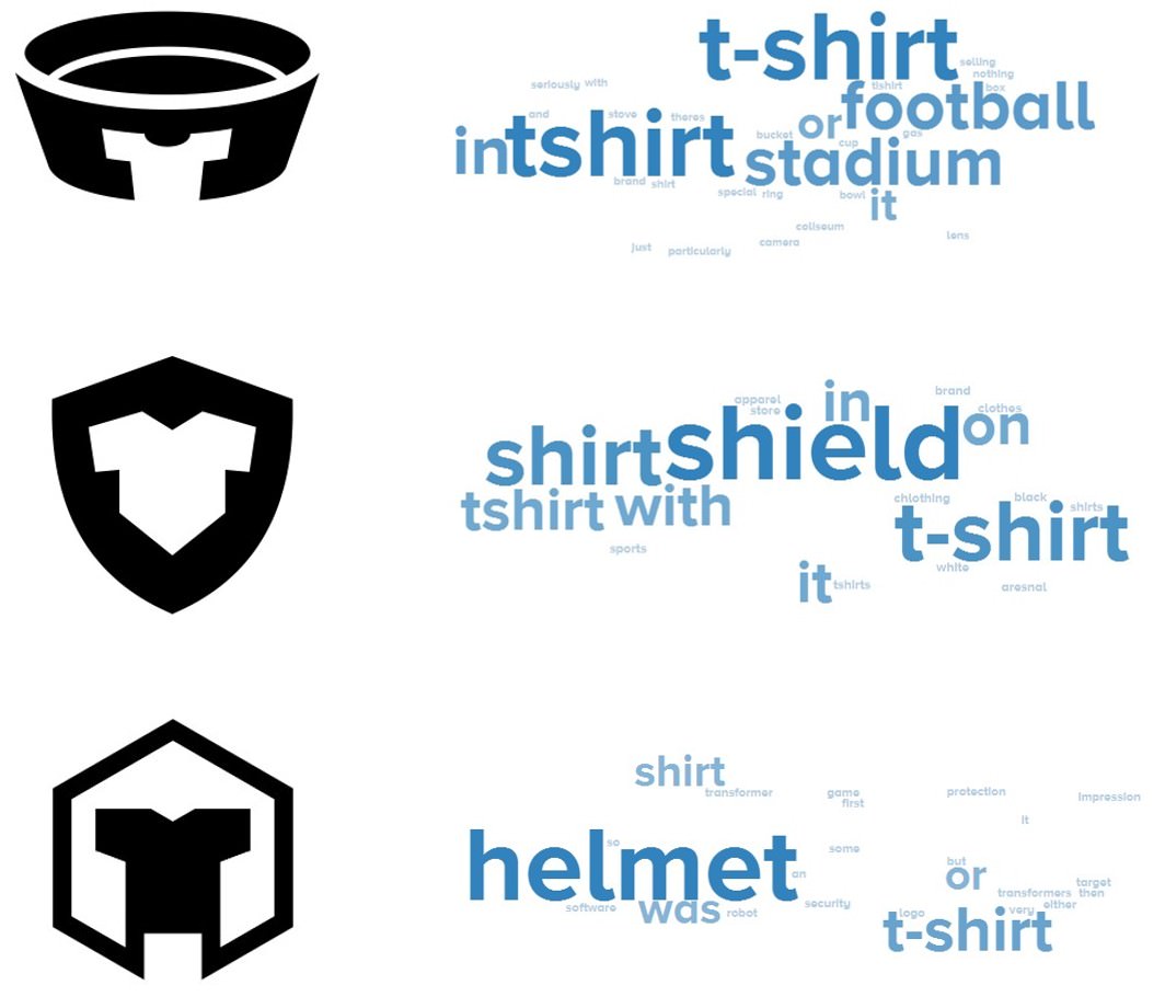
We designed the following logo for TeeArena, a web-shop for t-shirts (tee-s) where t-shirt designs fight for the best rankings. Tee designers can feel like gladiators in an arena. We experimented with multiple symbols. Do they effectively communicate that TeeArena is both related to t-shirts and fighting related stuff?
First impressions matter. Build your design on evidence!
On our facebook page we share further case studies from our work and exciting ideas. Follow us!
Imagine a future where lesson planning takes minutes, not hours—this is the promise of AI-driven…
In UX, most of the attention is on the surface: people are interested in wireframes,…
Slowly but surely, 2024 comes to an end, but the significance of investing in user…
Don’t judge a book by its cover. In the case of e-commerce websites from the…
You are standing in front of the participants, wondering where it went wrong. Why aren't…
The FinTech industry is rapidly growing and it can’t be stopped. As everything becomes more…